Happy Hump Day, everyone! 🐫 This week we've released 19 updates which include some great new features that I'm finally able to talk about! There are some meaty enhancements as well, so let's get right to it!
New Features
Have you ever noticed how Google shows a star rating and review count next to certain search results? It tends to be things that are commonly reviewed like products, vendors, lodging and so on. That got us thinking - how do we get our OwnerRez websites doing the same thing, and how do we make it dynamically change based on the reviews in OwnerRez? When someone searches for your property and it comes up on Google or Bing, it should have your star rating on it based on the number of reviews and average star count you have in OwnerRez. So we got it work and made that happen!
If you have an OwnerRez website, it will now show a review star rating in Google search results. Here's a quick example.
Couple of quick things to point about this... The star rating will only show on Google search results that are these pages on your website:
- Your home page
- Your reviews pages (if you have one showing)
- Specific property pages
So stuff like your FAQ or Availability page won't have a star rating on them when they come up in Google search results.
Another important thing is to understand how the star rating and review count are calculated.
On the home page and reviews page, the star rating is based on the total reviews associated with your website properties which not necessarily all of the reviews in your OwnerRez account. You may have reviews associated with disabled properties, or your website may not show all of your properties. Only the properties on the website will contribute to the review count and star rating.
The individual property pages only show a star rating and review count for that specific property. In the above screenshot, it shows a 4.7 star rating on 137 reviews for the Bear Timbers property page. Those numbers are specific to the one Bear Timbers property, not the other properties managed on the same website.
Last important note on the star rating and review count. What Google or Bing choose show on their search results is entirely up to them. They may stop supporting star ratings, or change the format, at any time. OwnerRez has no control over what Google shows or how it is displayed. They may also have a reason for not showing your star ratings on your website's search results even though they show it on other user's websites. We cannot contact Google about that or force Google to show something different; all we can do is publish the star rating and review count according to the spec they have defined. Also, it can be days or weeks for Google's search index to update - again, this is controlled by Google, not OwnerRez. No matter when you got a new review, Google will update their search index based on their own schedule, and we cannot accelerate that timeline on our side.
Speaking of websites, we added a new setting on websites to disable rates. This may seem minor, as new features go, but it's a bigger deal than you think. A lot of users who use our websites like to customize the experience of where/how guests see prices and they didn't want the min/max rates or other others of the site showing rates at all. If you know how to use CSS, you can change the styling on the website to hide parts of the page, and we host a page of CSS hacks to help people get started with that, but we decided that this deserved it's own setting. It's requested frequently and is hard to disable everywhere.
You can find the new rate display setting on the website's general settings page. About half way down, in the "Display" section, you'll see a new Rate Display field with some options:
You can select between a calendar and table rate type, or you can select none to turn off all the rates everywhere.
Airbnb recently started supporting the concept of "Rooms" on listings where you can define any ad hoc room in your vacation rental, in addition to bedrooms, and show photos for the new rooms as well. Booking.com does this as well. To support this, we've just released an update that let's you define ad hoc "rooms" in OwnerRez. We split off bedrooms from the Amenities tab under properties and made it a unique "Rooms" tab instead. Any existing bedrooms you had will still show under the new Rooms tab.
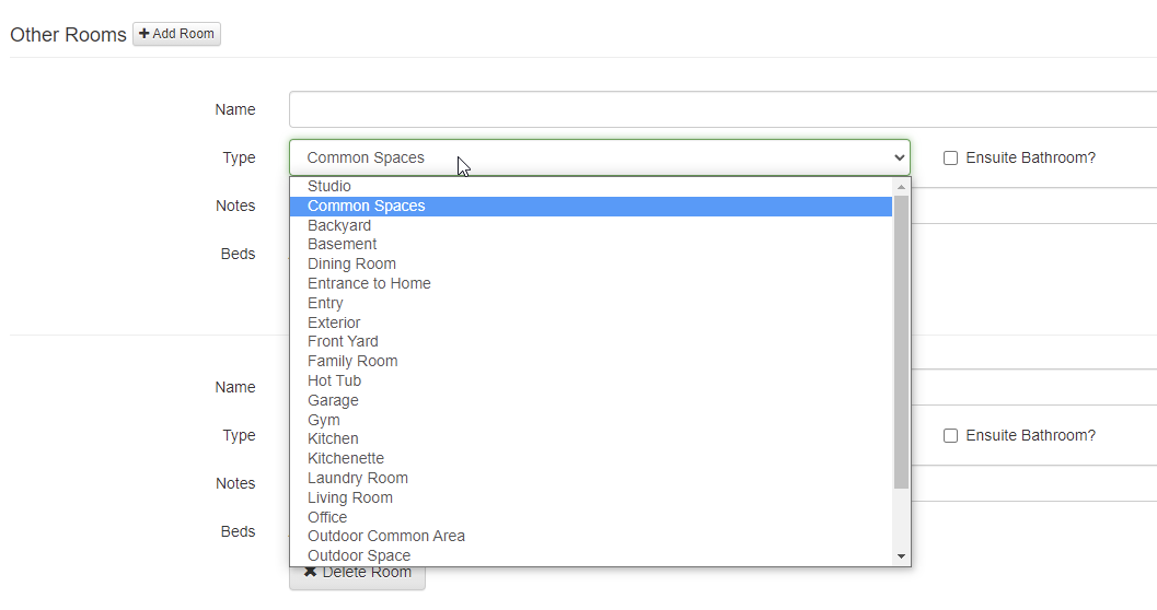
Click the Change button, and you'll see a similar layout to what we had before under the Amenities tab. If you scroll down to the bottom, you'll see a new section called "Other Rooms" with an "Add Room" button next to it. This is where you can add ad hoc rooms.
When adding your rooms, notice that there is a Type selector with dozens of options. Make sure to select the option that best describes your room.
In the future, we may have certain fields that show dynamically based on what you select here. For instance, selecting "garage" might ask you how many garage doors are there, and selecting "kitchen" might ask you to select appliances. We're also planning to link photos to the rooms you create here, so you can show actual pictures of garages, kitchens and so on. This will then push to Airbnb, so that they can show it automatically on their side. Those changes are coming soon.
In the meantime, notice that you can add beds and bathroom information to ad hoc "other rooms". This is where you would define common areas where guests can sleep. For instance, you might have a sleeper sofa in the living room that is part of your official sleep numbers. Don't add an official bedroom for that because that isn't accurate and would increase your bedroom count erroneously. Instead, add an "other room", set the type as "Living Room" and then click to add beds and select a sleeper sofa. This will make sure the rooms stay accurate but increase the sleep numbers appropriately.
Last, let's talk about our new Property Sharing feature.
A couple years ago, one of our awesome users in the Smoky Mountains area (Blue Mountain Cabins) decided to start hosting a local property alliance on their website. They knew a bunch of other OwnerRez users in their area, and they decided to band together and make a common web page, using OwnerRez widgets, so that they could show information about each other's cabins. The idea was to direct guests to other good owners in their area if their cabins weren't available, and create a group of owners that work together and share calendars. Over time, the alliance grew, and they now have close to 100 properties being shown on each others' websites.
To aid in this endeavor, we worked with Blue Mountain to hack up a setting that would allow our Property Search and Ribbon Calendar widgets to show other users' properties on their widgets. As you can see on the Smokey Mountain Alliance web page, the Property Search widget at the top and the Ribbon Calendar widget at the bottom show many properties on the same single widget. This happens because of a secret setting that we put on those widgets and then manual work we do to authorize and link other properties to their account.
Other OwnerRez users have wanted to set up the same kind of property sharing alliance in other regions of the world. We've told them no because we didn't want to do a lot of work by hand, but recently we decided to make this a self-service feature in OwnerRez itself. You now create and join Property Shares in OwnerRez!
To get started, go to Settings > Property Sharing (under the Website section of settings). You'll notice two tabs - "Shared With Me" and "Join A Share". If you click on Join A Share, you'll see any shares that other OwnerRez users have created. It looks like there are four as of the time I am writing this.
The "Published By" column is the OwnerRez user that created the share. This is the user that owns the share and will manage it for all of the users in the local alliance. By requesting to join it, you are asking that user to accept and show your properties, and it's up to them whether they will approve or deny your request.
If you want to create your own property share, you can do that on the "Shared With Me" tab. Please note that only one property share should be created in each local alliance. If you are working with another OwnerRez user to create an alliance of local owners, you do not each need to create shares. Only one user will create a share, and then that user will create widgets, and pass around the widget embed code so that all users in the same property share are hosting the same widget. You will share the same widget, not create separate widgets.
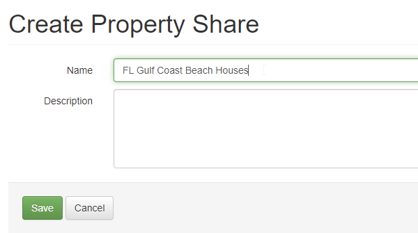
Creating a Property Share is very simple and only requires a name and description.
This is basically the public information you want other users to see when they look in the directory of all property shares on the "Join A Share" tab. Once you save your new Property Share, it will be publicly available for any other user to see and request access to.
After saving, the Property Share page will show you the name and description up top with some options to disable or delete it, and then a list of associated properties at the bottom.
By default, there won't be any associated properties because no other users will have requested access yet.
When other OwnerRez users go to the Property Sharing area, they'll now see your new share showing in the list and they can click the "Join" button to request access.
When a user does click the "Join" button, they'll see a list of their properties so that they can select the ones they want to be included on your property share.
On the requesting side, when you select properties to be included, the Status will change to "Pending".
If a property has no public Property URL set, the property cannot be included in your selection. All shared properties must have a public URL so that the shared widget (ie. the one all users in the share will use) show the URL for where guests should go to get to your website. If a property has no public URL, guests won't have anything to click on when they see your property in the list.
After you select the properties you want to be included, click Save and then contact the user who owns the property share and let them know that you requested access.
Please note that if you are the owner of the property share, you must request that your own properties be included and then approve those as well. Your own properties are not included by default until you "Join" them to the property share.
Back on the approving side, you'll see new properties showing up for you to approve. You can select them and approve or deny at any time.
The final part of property sharing is knowing where to use the property sharing publicly. This part is really simple. Property sharing works with all multi-property widgets. If you go to Widgets in the Settings area, and click the Create button, you'll see two widgets that are multi-property type widgets:
- Ribbon Calendar
- Availability/Property Search
If you create one of those, and drill in, you'll notice that the "Properties" field now allows you to select individual properties (like before) or property shares.
This tells the widget that instead of showing your own properties, you want it to show properties that are part of the property share. To be clear, only the property shares that you control can be selected here, so you must be the owner of the property share. If your properties are shared with someone else's property share, that other user is responsible for creating the widget and linking the property share to it. You cannot do that for them. That user will then provide you with the widget code or URL so that you can host the widget on your website.
We know this new Property Sharing area is a bit rusty, and we'll have another update out soon to correct some of the styling issues that have come up. In the meantime, you can begin creating property alliances in your local area and telling your friends. Remember though, in order to join it, the other owner has to be an OwnerRez user too!
Enhancements & Tweaks
As we work to update OwnerRez's overhaul design, we've started looking for areas of the system that haven't been updated in many years and have a super-old design. In order to do some major design updates, we first have to find those super-old areas and bring those up to the current design, which then will allow us to blanket-update everything in a comprehensive way. One of those super-old areas is the charge line items you see on bookings and quotes. This past week, we released a detailed update of the charges grid that brings it to the modern era. In particular, it now works well on mobile and tablet devices, adjusting accordingly to the available browser window.
To see it in action, open any booking and go the Charges tab, then click Change.
Right off, you'll notice some changes. The charges grid now expands to fill the entire width of the screen, making it easier to see and type changes, and all buttons, columns and text boxes follow our more-modern look and feel.
You still have the same controls you had before, but we've added a few new ones. For instance, on the left side of each rows, there's a drag handle that you can use to instantly re-order line items. Simply click on it and drag the row up or down and the line item will move accordingly.
To add new line items in the middle, simple click Add Charge at the bottom and then use the drag handle to move the row up to where you want it to be.
If you have a table or phone, you'll notice some major differences there too. On a tablet, the charges grid resizes to fill the space correctly while staying large enough to work on.
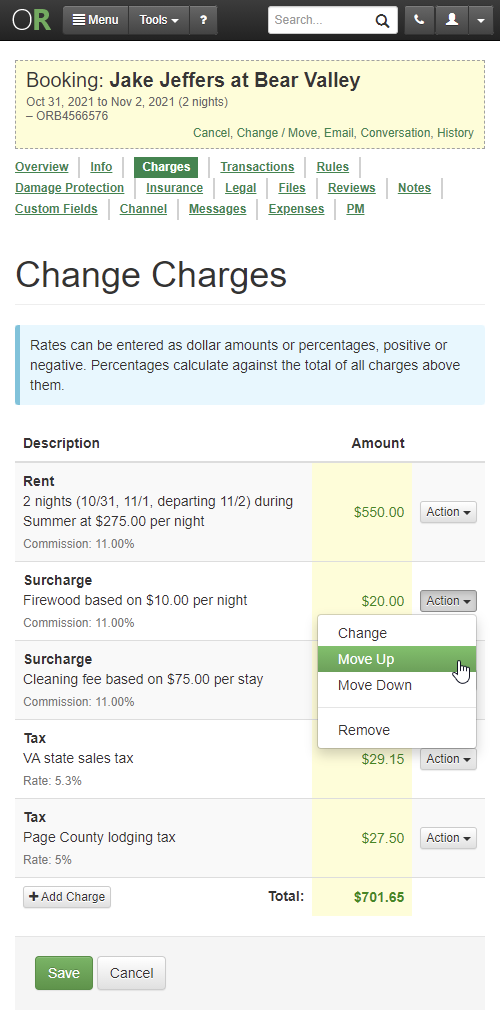
You'll notice that an "Action" button appears on the far right of each row with a Remove option inside that will delete the line item. If you're a PM, you'll notice that the Commission and Expense columns are gone and there are "Set Commission" and "Set Expense" options inside the Action button. Clicking those will open a window where you can set commission and expense amounts.
Now pull out your smartphone and take a look. The design is different there too.
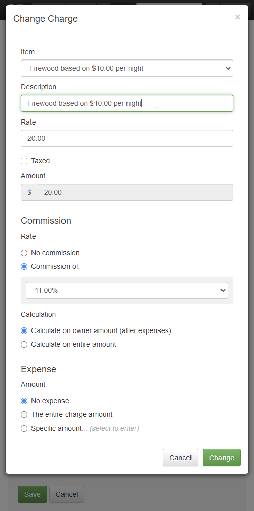
On mobile screens, all of the text boxes are gone, and the Action button has a "Change" option on each row. We did this because it was too difficult to squeeze in the text boxes next to each other, and stacking them on top of each other was confusing and ugly. So we streamlined it all away into a Change window that shows you a single line item at a time for editing.
The Type, Description, Rate text boxes are all there, and the Commission and Expense fields are too if you're a PM.
This should make it easier to edit charge line items on small screens. Enjoy!
While we were making design changes, we noticed some other areas that needed work. A few weeks ago, we overhauled the rate calendar significantly to change the colors, day style and how rates and rules were set. The feedback has been largely positive except for one thing - mobile screens. The changes added too many items to the screen which forced mobile screens to run out of space. This past week we corrected that and updated the rate calendar to maximize space on mobile screens.
Pull up the rate calendar on your mobile device, and you'll see that it looks much sleeker and a full month of days shows without having to scroll up or down.
The top tab are gone and the "Set Rate" and "Set Rules" middle button area has been collapsed to one line. The legend on the right is collapsed as well. This allows a full month to show easily, so that you can make your selection without doing a lot of scrolling.
Once you select your days, the "Set" button will light up and allow you to pick options inside it. The options are the same as before, only inside that button if you're on a small screen.
Saving space on mobile screens got us thinking that we should do the same thing elsewhere, so we took a look at all the Settings area pages and removed the yellow bar at the top.
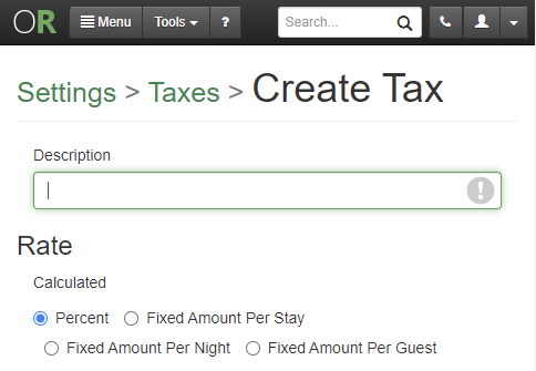
Instead of the old ugly yellow bar with the dotted line around it, we now show a breadcrumb link to "Settings" right in the page header. If you drill in further, you'll notice the page header include another link to the area you'll in as well. For instance, here's how it looks if you go to Taxes, and then drill in to create a new tax.
If you need to go to a different Settings page, click the link and go back to the Settings area and find the other page you're looking for. This saves an inch or two of space at the top of every page in the Settings area, when on mobile screens, without losing functionality. To be clear, this is only on mobile screens. On larger screens, the left sidebar still shows, though we are anticipating making changes to that as well in the future.
Enough about design! Let's move on to a smattering of other tweaks and enhancements, in no particular order...
Enjoy our Listing Quality Analyzer tool? We do too! This week, we added another check to LQA for overlapping Length of Stay (LOS) discounts. We noticed that some users have LOS discounts for periods of time, and sometimes the time periods overlap in ways the user didn't intend. You don't want LOS discounts to "stack up" with the guest getting multiple discounts and Airbnb doesn't allow it anyway, so we now warn you if we see that happening.
Previously, it was possible to have a Maximum Nights setting in your property rules, but also have a Minimum Nights in seasons or spot rates that were higher than the Maximum Nights length. This was difficult to find if you have a bunch of properties, but it makes the channels choke because the Minimum Nights rule ends up being bigger than the Maximum Nights allowed when we go to push rules to the channel. We added some validation to the property rules page that will show you this and stop you from saving a Maximum Night rule that is smaller than your Minimum Night rule even if that Minimum Night rule was set on a season or rate calendar elsewhere.
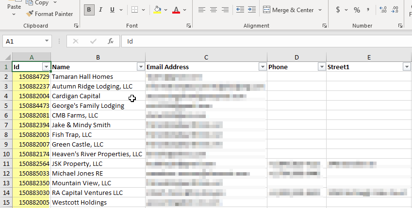
Our Excel import for expenses requires an owner ID when importing certain types of expenses, but where do you find the owner ID? Before there wasn't any easy place to find the owner ID, so we changed that. We now show the owner ID when exporting owners to Excel. Go to PM > Owners > Export and open the Excel file that is downloaded. You'll see a new column on the left called ID. That's the one you need.
Did you know OwnerRez has a really fast, powerful search engine built into the app? Yep, that search box that rides in the top menu is what I'm referring to. Every time you get an inquiry, quote, booking, guest, payment, refund or security deposit, the internal search engine updates instantly. You can search on names, addresses, phone numbers, email address - lots of stuff - and the results appear in less than a second. You can also filter your results by type of record and property. One thing we noticed however was that it wasn't possible to sort the results. The default sort was a bit random, so we added a sort option to the search page so that you can specifically select to sort by newest or oldest. By default, the results are ordered by newest.
Do you use a website powered by OwnerRez? If so, you'll want to check this out! This past week, we made a couple of tweaks to add clarity and information to your website.
You probably already know that every OwnerRez website has a built-in Test Location that can be used at any time. The Test Location is a URL that we host where you can see your live website even if your live domain name isn't ready or is pointing somewhere else. However, sometimes users give out the Test Location URL when linking from other places because they don't realize they aren't on the live domain name. To help with this, we now show a special warning bar on the website when you are looking at the website via the Test Location.
If you have a live domain name configured for your website, you'll also notice a new "Sitemap" field showing on the overview page of the website. There's a friendly copy button next to it too so you can copy/paste the Sitemap URL to other places.
For those that are curious, "sitemaps" are XML files that websites publish which tell search engines what URLs (or pages) the website contains. Sitemaps are basically a directory or guide containing all the URLs that the website owner (you!) wants search engines to know about. Some SEO tools like Moz, ahrefs or Google Webmaster Tools may ask for your sitemap, so we've published it publicly for you to copy/paste whenever you need it.
A quick pro tip on this... Search engines like Google and Bing should already know what your sitemap is because they pick it up automatically from your robots.txt file. Wait, what--?!? What the heck is "robots.txt" file?! That's another thing we publish automatically for your website. Go to your OwnerRez website really quick and type in "/robots.txt" after the domain name (eg. https://www.shenrent.com/robots.txt) and you'll see what I mean. That gobbledygook is a web standard, and OwnerRez provides it automatically for all websites. Notice that your sitemap is mentioned in there too.
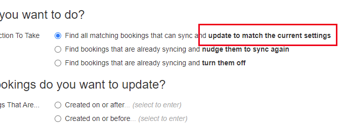
A few weeks ago, we put out a sweet little batch update for QuickBooks that lets you bulk find and turn off, turn on, or re-sync bookings on your own. It works great, but we noticed an scenario that it didn't handle - bookings that were associated with an old now-disabled QuickBooks connection aren't updated. Even if the property for those bookings was remapped to a new QuickBooks connection, the batch update just ignored them. To fix this, we updated the QuickBooks batch update screen to change the "turn on" setting into "update to match current settings".
This is more accurate because it will either turn on bookings that are off or switch a booking from an old QuickBooks connection to the new connection, depending on what your current QuickBooks property mappings are set to.
Bug Fixes
Optimized merge emails on Booking.com wrong room. We send out automatic system alerts when Booking.com bookings have issues or can't be merged into OwnerRez correctly, and we found some scenarios where the messaging was wrong or not ideal. There was a "skip message" being set on merge booking emails for each room, but there were additional rooms that could be processed so we're now clearing that message when the changes are processed. Also, Booking.com merge wasn't handling cases where a booking changed properties, so we updated our code to detect that like we already do for Airbnb bookings.
The plural of couch is.... "couchs"? There was a typo in the bedroom amenities list when multiple couches were entered as beds. This has been fixed.
Show beds regardless of bedrooms. We noticed an issue on our hosted website where if a property has no bedrooms, the "Bedrooms" section of the amenities was not shown. While this is technically correct, we still wanted to show where the guest is supposed to sleep so we changed "Bedrooms" to "Sleeping Arrangements" and made sure to always show beds from the other rooms that have places to sleep.
Better PDF rendering for modern styling and content. There are a number of places in OwnerRez that create PDF files on demand. Downloading renter agreements and owner statements are two examples of where PDFs are created on the fly. We noticed that some content styling (what is technically referred to as CSS) was showing incorrectly on the PDF version. For instance, there were super large logo images in the PDF that were supposed to be smaller. Our PDF rendering engine hadn't been updated in many years, so we overhauled it with a new version. The new PDF rendering engine handles modern content and styling perfectly.


